Comments on Graduation Poster:
Jevon - Needs some sort of background. Brush work is excellent. The diploma gets a little lost.
Lindsay - The drop shadow is too strong. Great texture and feel.
Response: I decided to remove the drop shadow and put a transparent box around the text so it appears to have a type of background. I wanted it simple and to have a kind of t-shirt appeal, because the text already has that feeling.
Jevon - Empty at the bottom. It should be more tied in to midterms.
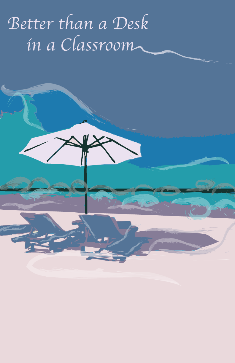
Lindsay: Terrific contrast. Like the texture the brushwork creates. It gives the viewer the feeling they are there and could reach out and feel the sand or the water.
Response: I put more brushwork at the bottom to create more depth and texture.